
Before you head to the home improvement store or meet with your painter, you might just want to check out the trending paint colors for the year — which will probably make anyone liking blues or terra cotta colors supremely happy.
While every purveyor of paint has their own take, one thing we noticed right off the bat was that most either had a signature blue or a signature orange this year.
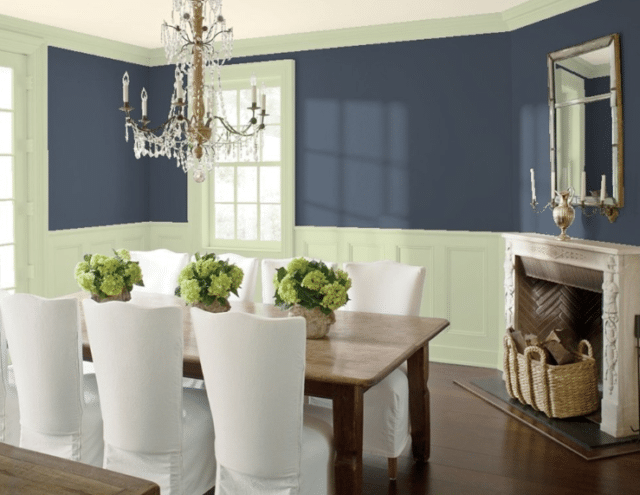
Take, for instance, Benjamin Moore’s Hale Navy, which can complement almost every other 2019 Benjamin Moore color, which is light on the orange but does include a pink (Head Over Heels).

Hale Navy does seem to do best with a taupe, though, but is a nice neutral that can be either feminine or masculine, depending on your complementary colors, including its color of the year, Metropolitan.
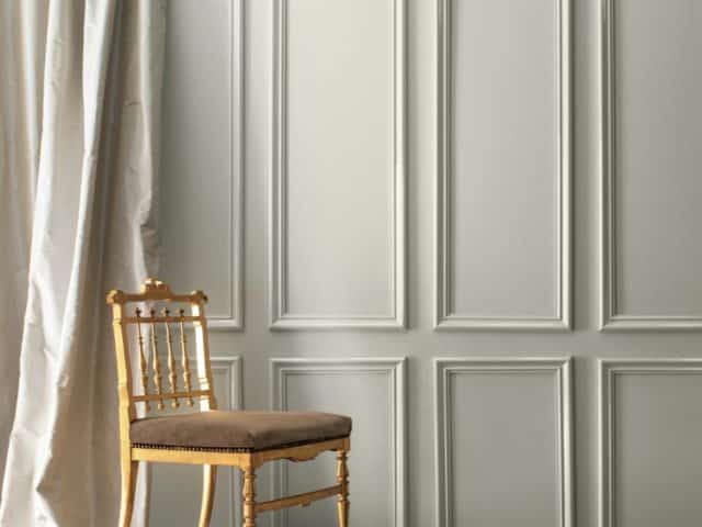
“Comforting, composed and effortlessly sophisticated, Metropolitan AF-690 exudes beauty and balance,” Ellen O’Neill, Benjamin Moore Director of Strategic Design Intelligence, said in a press release. “It’s a color in the neutral spectrum that references a contemplative state of mind and design. Not arresting nor aggressive, this understated yet glamorous gray creates a soothing, impactful common ground.”
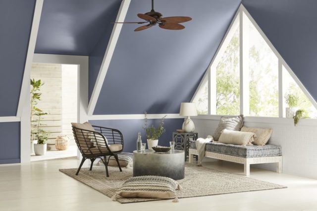
Behr’s Blueprint was named its color of the year for 2019, and while it also had some pinky hues, its orange definitely skews more New Mexico than Havana.
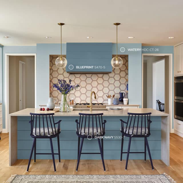
“Much like the sketches builders rely on to bring an architectural design to life, Blueprint S470-5 lays a foundation for consumers to make their unique vision a reality,” Erika Woelfel, vice president of color and creative services at Behr said in a statement. “This universally appealing hue provides a steady stream of positivity and is poised to be an instant classic for years to come.”
“Blueprint makes it easy for homeowners and apartment dwellers across the country to reimagine their space,” said Jodi Allen, chief marketing officer for Behr. Of course, choosing the right color is only half the battle; execution matters just as much. Whether you’re drawn to Blueprint’s grounded calm or the earthy warmth of a terra cotta palette, having a skilled professional bring that vision to life makes all the difference. If you’re in the area, Ponte Vedra Beach, FL, painters can help you translate any of these trending palettes into a finished result that looks as good on your walls as it does in the swatch.
Eschewing the blues and grays of Behr and Benjamin Moore, Sherwin Williams named Cavern Clay its color of the year. It’s a terra cotta orange that plays well with bold colors, but also with five colors the company says are key color combinations — which include a blue, a taupe, and even a green.
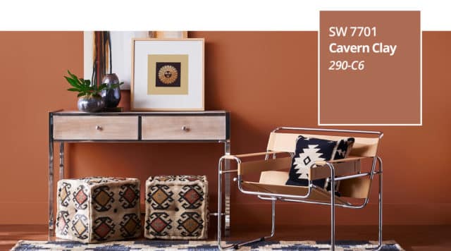
“We believe 2019 will be a renaissance of the 1970s-with a twist. In the coming year, we will embrace our pioneering spirits and artisan ingenuity,” Sue Wadden, director of color marketing, Sherwin-Williams said in a statement. “Our 2019 Color of the Year, Cavern Clay, embodies renewal, simplicity and free-spirited, bohemian flair.”
“Cavern Clay is an easy way to bring the warmth of the outdoors in. Envision beaches, canyons and deserts, and sun-washed late summer afternoons—all of this embodied in one color,” she added.
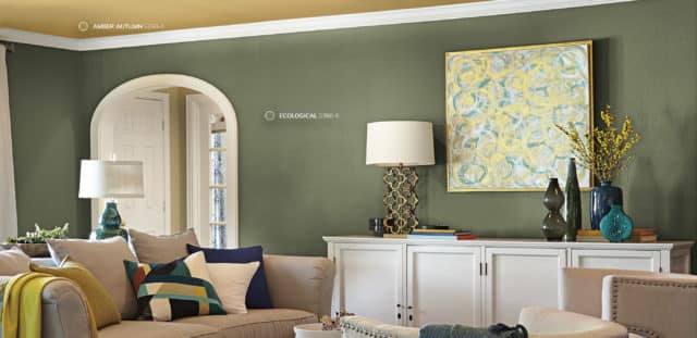
PPG went with a completely different color for its 2019 choice — a dark green called Night Watch that pairs with several of its other trend color palettes.

“Our newest beauty is born out of community, luxury and nature. In an ever-disruptive world, we want to escape to a quieter place – one that’s protective and beautiful,” the company said. “Night Watch gives us that pathway. It’s a black infused green that can be used as a neutral or statement accent.”
“Night Watch can make you feel healthy, grounded and calm, allowing other coordinating décor colors or interior plants to be showcased against its luxe backdrop.”
And while the winner of Ace Hardware’s color of the year contest was a light yellow called Pineapple Cream Granita by Clark+Kensington, the rest of the finalists hewed closely to what the big paint companies say is trending, lending credence to the claims that blues and southwestern hues will dominate this year. Ace invited customers to come up with their own color combinations during events held at neighborhood stores, and then experts and social media followers voted.
“When I created this color, I was daydreaming about enjoying a delicious dessert while on a relaxing vacation in Sicily with my daughter,” said winner Francine C. “The color is soothing and yet bright; sweet with just a bit of tartness. It was so much fun to participate in this process and I hope everyone loves Pineapple Cream Granita as much as we do!”

Valspar, however, couldn’t narrow it down to just one, and chose 12 colors of the year that include Metropolis Lilac, Angelic Blue, Green Water, Twilight Mist, Spring Squash, and Lime Mousse.

“The Valspar Colors of the Year are bolder takes on basic colors to provide color-curious consumers the opportunity to create change within their homes in an easy, fun and attainable way. We believe changing your outlook can be as easy as changing the paint on your walls,” said Sue Kim, Valspar Senior Color Designer at Sherwin-Williams Consumer Brands Group. “Orange Slice, for instance, evokes a sense of playfulness, while Twilight Mist brings an aura of mystery.”

All of this seems to be somewhat of a toned down version of Pantone’s Color of the Year — Living Coral. A pinky orange that is bold and requires bravery for large doses, perhaps paint companies were looking for a broader, tamer audience with their more muted terracotta versions paired with sleek (and even sedate) greys and blues.
But Pantone was having none of that.
“Color is an equalizing lens through which we experience our natural and digital realities and this is particularly true for Living Coral,” said Leatrice Eiseman, Executive Director of the Pantone Color Institute. “With consumers craving human interaction and social connection, the humanizing and heartening qualities displayed by the convivial Pantone Living Coral hit a responsive chord.”
“Color enhances and influences the way we experience life,” said Laurie Pressman, Vice President of the Pantone Color Institute. “As a shade that affirms life through a dual role of energizing and nourishing, PANTONE 16-1546 Living Coral reinforces how colors can embody our collective experience and reflect what is taking place in our global culture at a moment in time.”

